Field Types Reference
This document provides a comprehensive reference for all available field types in YAML configuration files for detail components.
Example yml File with all field types
title: Example Detail
description: An example detail with all field types
tabs:
  - number: 1
    label: General
  - number: 2
    label: Details
  - number: 3
    label: Media
fields:
  # ===========================================
  # TAB 1: General (Basic Types)
  # ===========================================

  # text - Standard text input
  - name: detailData.name
    label: Name
    type: text
    colspan: 6
    required: true

  # text (email) - Email input
  - name: detailData.email
    label: Email
    type: email
    colspan: 6

  # text (number) - Number input
  - name: detailData.quantity
    label: Quantity
    type: number
    colspan: 3

  # text (date) - Date picker
  - name: detailData.birth_date
    label: Birth Date
    type: date
    colspan: 3

  # text (time) - Time picker
  - name: detailData.start_time
    label: Start Time
    type: time
    colspan: 3

  # text (datetime-local) - Datetime picker
  - name: detailData.scheduled_at
    label: Scheduled At
    type: datetime-local
    colspan: 3

  # colorHex - Color picker with HEX value
  - name: detailData.color
    label: Color
    type: colorHex
    colspan: 3

  # textarea - Multi-line text
  - name: detailData.description
    label: Description
    type: textarea
    colspan: 12
    rows: 4

  # checkbox - Boolean toggle
  - name: detailData.is_active
    label: Active
    type: checkbox
    colspan: 3
    live: true

  # checkbox with showIf condition
  - name: detailData.notify_email
    label: Notify
    type: checkbox
    colspan: 3
    showIf: detailData.is_active

  # ===========================================
  # Selection Types
  # ===========================================

  # select - Static dropdown options
  - name: detailData.priority
    label: Priority
    type: select
    colspan: 4
    options:
      - value: low
        label: Low
      - value: medium
        label: Medium
      - value: high
        label: High

  # picklist - Dynamic dropdown from component method
  - name: detailData.warehouse_id
    label: Warehouse
    type: picklist
    picklistField: getWarehouseOptions
    colspan: 4

  # ===========================================
  # Relations
  # ===========================================

  # relation - Modal-based foreign key selection
  - name: detailData.customer_id
    label: Customer
    type: relation
    relationField: relationTitles.customer_id
    modalComponent: customers-list
    colspan: 6

  # belongsToMany - Tag-style many-to-many selection
  - name: tagIds
    label: Tags
    type: belongsToMany
    optionsMethod: getTagOptions
    colspan: 6

  # ===========================================
  # Special Selects
  # ===========================================

  # collection-select - CMS Collection dropdown
  - name: detailData.collection_id
    label: Collection
    type: collection-select
    colspan: 6

  # setupCollectionSelect - Setup Collection dropdown
  - name: detailData.country_id
    label: Country
    type: setupCollectionSelect
    collectionKey: countries
    displayField: name
    colspan: 6

  # ===========================================
  # TAB 2: Details (Rich Content & Translatable)
  # ===========================================

  # richText - WYSIWYG editor
  - name: detailData.content
    label: Content
    type: richText
    colspan: 12
    tab: 2

  # translatableText - Multi-language text
  - name: detailData.title
    label: Title
    type: translatableText
    colspan: 12
    tab: 2

  # translatableTextarea - Multi-language textarea
  - name: detailData.summary
    label: Summary
    type: translatableTextarea
    colspan: 12
    tab: 2

  # translatableRichText - Multi-language WYSIWYG
  - name: detailData.body
    label: Body
    type: translatableRichText
    colspan: 12
    tab: 2

  # ===========================================
  # TAB 3: Media & Actions
  # ===========================================

  # image - Media library image selection
  - name: detailData.image_id
    label: Image
    type: image
    colspan: 6
    tab: 3

  # file - File upload
  - name: document
    label: Document
    type: file
    accept: '.pdf,.doc,.docx'
    colspan: 6
    tab: 3

  # button - Action button
  - name: generateCode
    label: 'Generate Code'
    type: button
    colspan: 3
    tab: 3

  # text (readonly) - Read-only field showing generated value
  - name: detailData.code
    label: Code
    type: text
    colspan: 3
    readonly: true
    tab: 3

  # ===========================================
  # Block - Nested field container
  # ===========================================

  - type: block
    title: Address
    colspan: 12
    tab: 3
    fields:
      - name: detailData.street
        label: Street
        type: text
        colspan: 8
      - name: detailData.house_number
        label: House Number
        type: text
        colspan: 4
      - name: detailData.zip
        label: Zip Code
        type: text
        colspan: 4
      - name: detailData.city
        label: City
        type: text
        colspan: 8

  # ===========================================
  # Conditional Display Examples
  # ===========================================

  # showIf with boolean field
  - name: detailData.has_discount
    label: Has Discount
    type: checkbox
    colspan: 3
    live: true
    tab: 3
  - name: detailData.discount_percent
    label: Discount
    type: number
    colspan: 3
    showIf: detailData.has_discount
    tab: 3

  # showIf with value comparison
  - name: detailData.type
    label: Type
    type: select
    colspan: 3
    live: true
    tab: 3
    options:
      - value: private
        label: Private
      - value: business
        label: Business

  - name: detailData.company_name
    label: Company
    type: text
    colspan: 3
    tab: 3
    showIf:
      field: detailData.type
      value: business

  # showIfNot - Hide when condition is true
  - name: detailData.private_notes
    label: Private Notes
    type: textarea
    colspan: 6
    tab: 3
    showIfNot:
      field: detailData.type
      value: business
Overview
| Type | Description | Component |
|---|---|---|
text |
Standard text input (also email, number, date, time, datetime-local) | input.blade.php |
colorHex |
Color picker with HEX value | color-hex.blade.php |
textarea |
Multi-line text field | input-textarea.blade.php |
select |
Dropdown with static options | input-select.blade.php |
picklist |
Dropdown with dynamic options (via Livewire method) | picklist.blade.php |
checkbox |
Boolean checkbox | checkbox.blade.php |
relation |
Modal-based selection for relations | input-relation.blade.php |
image |
Image selection from Media library | image.blade.php |
file |
File upload | file.blade.php |
richText |
TipTap WYSIWYG editor | rich-text.blade.php |
translatableText |
Multi-language text field | translatable-text.blade.php |
translatableTextarea |
Multi-language textarea | translatable-textarea.blade.php |
translatableRichText |
Multi-language rich text editor | translatable-rich-text.blade.php |
belongsToMany |
Many-to-many tag selection with search | belongs-to-many.blade.php |
collection-select |
CMS Collection selection | input-collection-select.blade.php |
setupCollectionSelect |
Setup Collection selection | setup-collection-select.blade.php |
button |
Action button | button.blade.php |
block |
Container for nested fields | (in block.blade.php) |
Common Options
These options are available for most field types:
| Option | Type | Default | Description |
|---|---|---|---|
name |
string | required | Property path (e.g., detailData.email, detailData.customer_id) |
label |
string | required | Translation key for the field label |
type |
string | text |
Field type |
colspan |
int | 3 |
Width in grid columns (1-12) |
required |
bool | false |
Show required indicator on label |
readonly |
bool | false |
Make field read-only |
live |
bool | false |
Enable real-time updates (wire:model.live.debounce) |
tab |
int | 1 |
Tab number for multi-tab forms |
showIf |
string/object | - | Condition to show the field |
showIfNot |
string/object | - | Condition to hide the field |
show |
bool | true |
Statically show/hide the field |
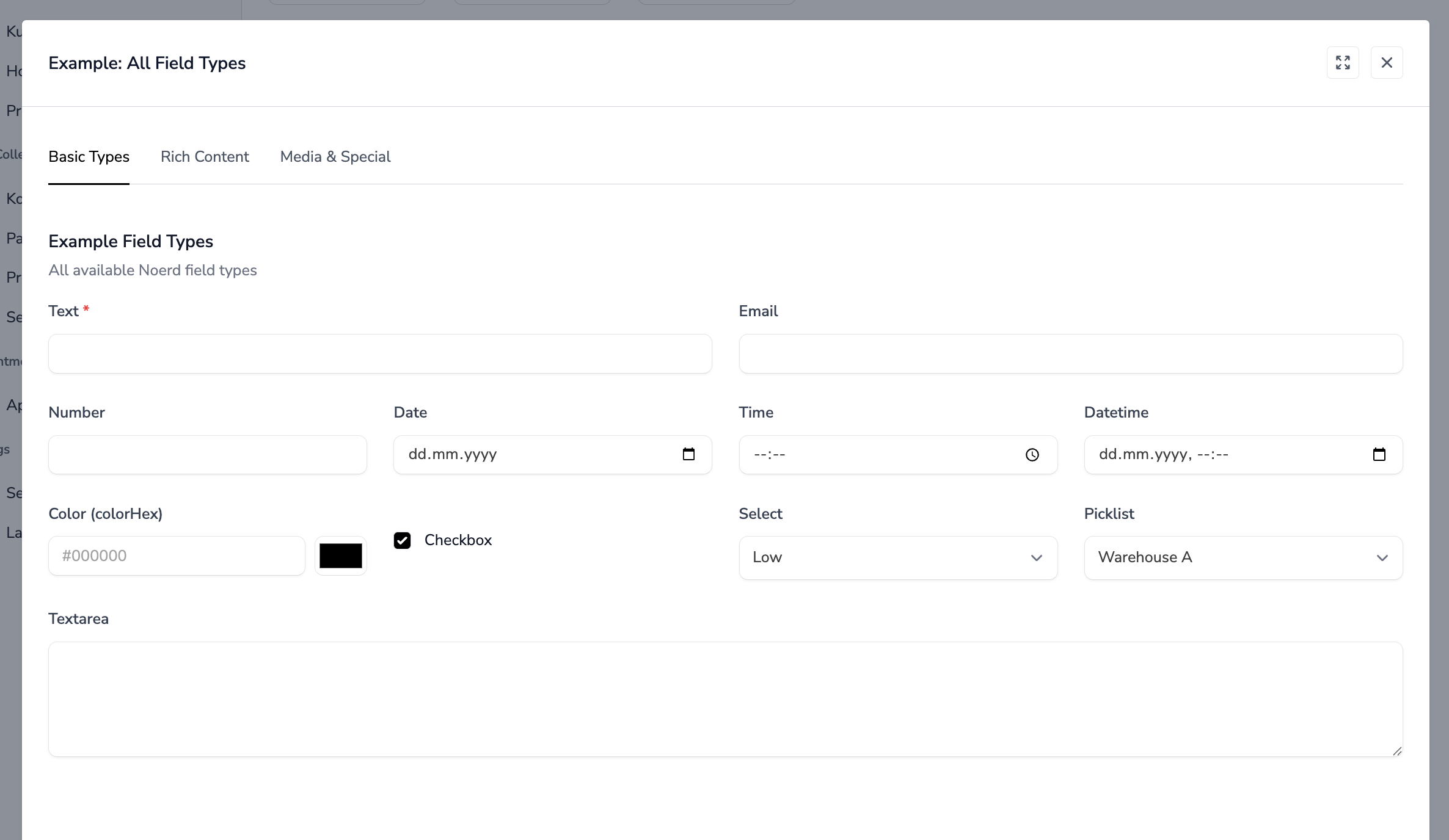
Basic Types
text
Standard text input field. Also handles HTML5 input types like email, number, date, time, and datetime-local.
Options:
| Option | Type | Default | Description |
|---|---|---|---|
type |
string | text |
Input type: text, email, number, date, time, datetime-local |
readonly |
bool | false |
Make field read-only |
live |
bool | false |
Enable real-time updates |
required |
bool | false |
Show required indicator |
YAML Example:
# Simple text field
name: detailData.name
  label: Name
  type: text
  colspan: 6

# Email field
name: detailData.email
  label: Email
  type: email
  colspan: 6
  required: true

# Number field
name: detailData.quantity
  label: Quantity
  type: number
  colspan: 3

# Date field
name: detailData.birth_date
  label: Birth Date
  type: date
  colspan: 4

# Time field
name: detailData.start_time
  label: Start Time
  type: time
  colspan: 4

# Datetime field
name: detailData.scheduled_at
  label: Scheduled At
  type: datetime-local
  colspan: 6

# Read-only field with live updates
name: detailData.code
  label: Code
  type: text
  colspan: 4
  readonly: true
  live: true
Notes:
datetype automatically truncates datetime values to date only (YYYY-MM-DD)timetype automatically truncates to HH:MM format
colorHex
Color picker with HEX value input. Combines a text input for manual HEX entry with a native color picker for visual selection. Both inputs are synchronized.
Options:
| Option | Type | Default | Description |
|---|---|---|---|
readonly |
bool | false |
Make field read-only |
live |
bool | false |
Enable real-time updates |
required |
bool | false |
Show required indicator |
YAML Example:
# Basic color picker
name: detailData.color
  label: Color
  type: colorHex
  colspan: 4

# Color picker with live updates
name: detailData.background_color
  label: Background Color
  type: colorHex
  colspan: 4
  live: true

# Read-only color display
name: detailData.theme_color
  label: Theme Color
  type: colorHex
  colspan: 4
  readonly: true
Database Value:
#efefefNotes:
- Stores the color as a 7-character HEX string (e.g.,
#efefef) - The text input allows manual entry with a
#prefix - The color picker synchronizes with the text input in both directions
- Maximum length is 7 characters
textarea
Multi-line text field.
Options:
| Option | Type | Default | Description |
|---|---|---|---|
rows |
int | 8 |
Number of visible text rows |
readonly |
bool | false |
Make field read-only |
required |
bool | false |
Show required indicator |
YAML Example:
# Standard textarea
name: detailData.description
  label: Description
  type: textarea
  colspan: 12

# Textarea with custom rows
name: detailData.notes
  label: Notes
  type: textarea
  colspan: 12
  rows: 4

# Read-only textarea
name: detailData.system_log
  label: Log
  type: textarea
  colspan: 12
  readonly: true
checkbox
Boolean checkbox field.
Options:
| Option | Type | Default | Description |
|---|---|---|---|
readonly |
bool | false |
Disable the checkbox |
live |
bool | false |
Enable real-time updates |
YAML Example:
# Simple checkbox
name: detailData.is_active
  label: Active
  type: checkbox
  colspan: 3

# Checkbox with live updates (useful for conditional fields)
name: detailData.has_discount
  label: Has Discount
  type: checkbox
  colspan: 3
  live: true

# Disabled checkbox
name: detailData.is_system
  label: System
  type: checkbox
  colspan: 3
  readonly: true
Notes:
- Handles both boolean values and string "1"/"0" values correctly
- Vertically aligns with other form elements
Selection Types
select
Dropdown with statically defined options in the YAML file.
Options:
| Option | Type | Default | Description |
|---|---|---|---|
options |
array | required | Array of options |
live |
bool | false |
Enable real-time updates |
required |
bool | false |
Show required indicator |
Option Format:
options:
  - value: key1
    label: Label 1
  - value: key2
    label: Label 2
# OR simple format (value = label):
options:
  - 'Option 1'
  - 'Option 2'
YAML Example:
# Select with value/label pairs
name: detailData.priority
  label: Priority
  type: select
  colspan: 6
  options:
    - value: low
      label: Low
    - value: medium
      label: Medium
    - value: high
      label: High

# Select with simple options
name: detailData.status
  label: Status
  type: select
  colspan: 6
  options:
    - 'Draft'
    - 'Published'
    - 'Archived'

# Select with live updates
name: detailData.category
  label: Category
  type: select
  colspan: 6
  live: true
  options:
    - value: a
      label: Category A
    - value: b
      label: Category B
picklist
Dropdown with dynamically loaded options from a Livewire component method.
Options:
| Option | Type | Default | Description |
|---|---|---|---|
picklistField |
string | required | Name of the component method that returns options |
live |
bool | false |
Enable real-time updates |
required |
bool | false |
Show required indicator |
YAML Example:
name: detailData.warehouse_id
  label: Warehouse
  type: picklist
  picklistField: getWarehouseOptions
  colspan: 6
PHP Example (Livewire Component):
public function getWarehouseOptions(): array
{
    return Warehouse::where('tenant_id', auth()->user()->selected_tenant_id)
        ->pluck('name', 'id')
        ->toArray();
}
Notes:
- The method must return an associative array
[id => label, ...] - Useful when options depend on other model data or complex queries
Relations
relation
Modal-based selection for foreign key relationships. Opens a list modal where users can search and select a related record.
Options:
| Option | Type | Default | Description |
|---|---|---|---|
modalComponent |
string | required | Livewire list component to show in modal |
relationField |
string | - | Path to display value (default: relationTitles.{field_id}) |
modelId |
int | 0 |
Optional ID passed to modal |
readonly |
bool | false |
Make field read-only |
live |
bool | false |
Enable real-time updates |
required |
bool | false |
Show required indicator |
YAML Example:
name: detailData.customer_id
  label: Customer
  type: relation
  relationField: relationTitles.customer_id
  modalComponent: customers-list
  colspan: 6
PHP Example (Livewire Component):
use Livewire\Attributes\On;

public array $relationTitles = [];

public function mount(Product $product): void
{
    if ($this->modelId) {
        $product = Product::with('customer')->find($this->modelId);
        $this->relationTitles['customer_id'] = $product->customer?->name ?? '';
    }
    $this->detailData = $product->toArray();
}

#[On('customerSelected')]
public function customerSelected($customerId): void
{
    $customer = Customer::find($customerId);
    $this->detailData['customer_id'] = $customer->id;
    $this->relationTitles['customer_id'] = $customer->name;
}
Notes:
- The modal component must dispatch an event named
{entity}Selected(e.g.,customerSelected) - Always use
relationTitlesarray for display values, never create separate properties - The
modalComponentmust havelistActionMethod: 'selectAction'configured
belongsToMany
Tag-style selection for many-to-many relationships with search functionality.
Options:
| Option | Type | Default | Description |
|---|---|---|---|
optionsMethod |
string | required | Component method returning available options |
required |
bool | false |
Show required indicator |
YAML Example:
name: tagIds
  label: Tags
  type: belongsToMany
  optionsMethod: getTagOptions
  colspan: 12
PHP Example (Livewire Component):
public array $tagIds = [];

public function mount(Article $article): void
{
    $this->tagIds = $article->tags->pluck('id')->toArray();
}

public function getTagOptions(): array
{
    return Tag::where('tenant_id', auth()->user()->selected_tenant_id)
        ->pluck('name', 'id')
        ->toArray();
}

public function store(): void
{
    $article = Article::updateOrCreate(
        ['id' => $this->modelId],
        $this->detailData
    );

    $article->tags()->sync($this->tagIds);
}
Notes:
- Features built-in search with keyboard navigation (arrow keys, Enter, Escape)
- Selected items appear as removable tags
- The component property must be an array of IDs (e.g.,
$tagIds)
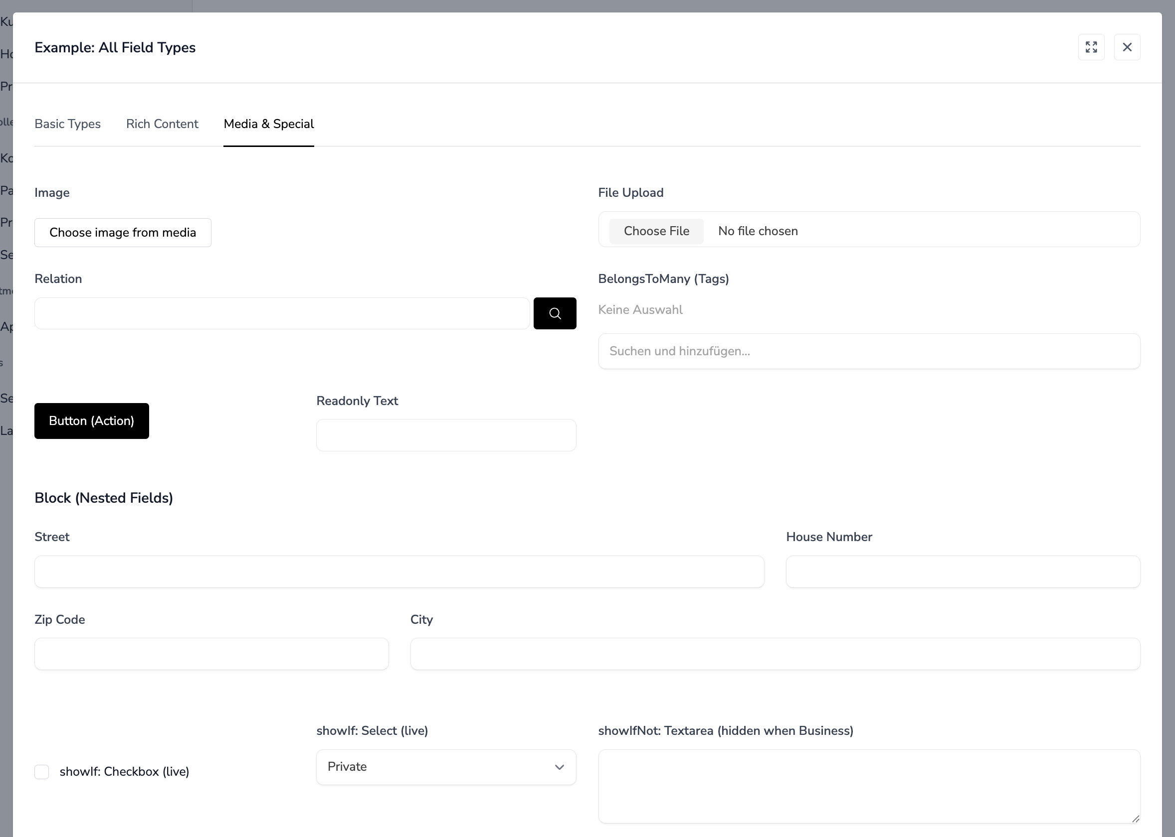
Media Types
image
Image selection from the Media library.
Options:
| Option | Type | Default | Description |
|---|---|---|---|
name |
string | required | Field name (stores Media ID or URL) |
label |
string | required | Translation key |
YAML Example:
name: detailData.image_id
  label: Image
  type: image
  colspan: 6
PHP Example (Livewire Component):
public function openSelectMediaModal(string $fieldName): void
{
    $this->dispatch('noerdModal', [
        'modalComponent' => 'media-list',
        'arguments' => [
            'context' => $fieldName,
            'listActionMethod' => 'selectAction'
        ]
    ]);
}

#[On('mediaSelected')]
public function mediaSelected($mediaId, $context): void
{
    $this->detailData[$context] = $mediaId;
}

public function deleteImage(string $fieldName): void
{
    $this->detailData[str_replace('detailData.', '', $fieldName)] = null;
}
Notes:
- Shows a preview thumbnail when an image is selected
- Includes delete button with confirmation dialog
- Stores Media model ID as the value
file
File upload field with Livewire integration.
Options:
| Option | Type | Default | Description |
|---|---|---|---|
multiple |
bool | false |
Allow multiple file selection |
accept |
string | - | Accepted file types (e.g., .pdf,.doc) |
live |
bool | false |
Enable real-time upload |
YAML Example:
# Single file upload
name: document
  label: Document
  type: file
  colspan: 6

# Multiple files with type restriction
name: attachments
  label: Attachments
  type: file
  multiple: true
  accept: '.pdf,.doc,.docx'
  colspan: 12

# Image upload with live preview
name: photo
  label: Photo
  type: file
  accept: 'image/*'
  live: true
  colspan: 6
PHP Example (Livewire Component):
use Livewire\WithFileUploads;

class DocumentDetail extends Component
{
    use WithFileUploads;

    public $document;

    public function store(): void
    {
        $this->validate([
            'document' => 'required|file|mimes:pdf|max:10240',
        ]);

        $path = $this->document->store('documents');
        // ...
    }
}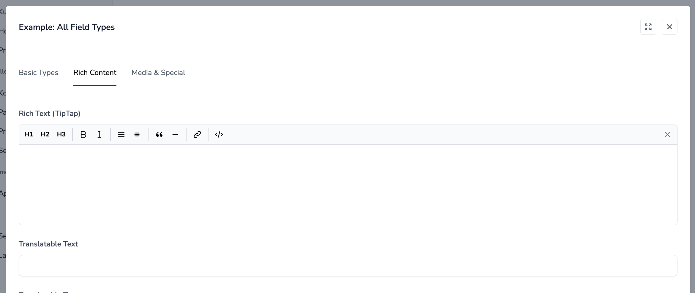
Rich Text
richText
TipTap WYSIWYG editor for formatted text content.
Options:
| Option | Type | Default | Description |
|---|---|---|---|
name |
string | required | Field name |
label |
string | required | Translation key |
YAML Example:
name: detailData.content
  label: Content
  type: richText
  colspan: 12
Notes:
- Uses TipTap editor with standard formatting options
- Content is stored as HTML
- Automatically retrieves content from
$detailDataarray
Translatable Fields
These field types store content as JSON objects with language keys (e.g., {"de": "...", "en": "..."}).
translatableText
Multi-language single-line text field.
Options:
| Option | Type | Default | Description |
|---|---|---|---|
readonly |
bool | false |
Make field read-only |
live |
bool | false |
Enable real-time updates |
YAML Example:
name: detailData.title
  label: Title
  type: translatableText
  colspan: 12
Database Value:
{"de": "Deutscher Titel", "en": "English Title"}translatableTextarea
Multi-language multi-line text field.
Options:
| Option | Type | Default | Description |
|---|---|---|---|
readonly |
bool | false |
Make field read-only |
required |
bool | false |
Show required indicator |
YAML Example:
name: detailData.description
  label: Description
  type: translatableTextarea
  colspan: 12
translatableRichText
Multi-language WYSIWYG editor.
YAML Example:
name: detailData.body
  label: Body
  type: translatableRichText
  colspan: 12
Notes:
- All translatable fields react to
session('selectedLanguage')(defaults to'de') - Language switching is handled globally by the application
Special Types
collection-select
Dropdown for selecting CMS Collection entries.
Options:
| Option | Type | Default | Description |
|---|---|---|---|
readonly |
bool | false |
Disable the select |
live |
bool | false |
Enable real-time updates |
required |
bool | false |
Show required indicator |
YAML Example:
name: detailData.collection_id
  label: Collection
  type: collection-select
  colspan: 6
Notes:
- Automatically loads all CMS Collections for the current tenant
- Includes a search button that opens a modal with collection entries
setupCollectionSelect
Dropdown for selecting entries from a Setup Collection.
Options:
| Option | Type | Default | Description |
|---|---|---|---|
collectionKey |
string | required | The setup collection key |
displayField |
string | name |
Field to display as option label |
live |
bool | false |
Enable real-time updates |
required |
bool | false |
Show required indicator |
YAML Example:
name: detailData.country_id
  label: Country
  type: setupCollectionSelect
  collectionKey: countries
  displayField: name
  colspan: 6
Notes:
- Supports translatable display fields
- Automatically handles locale fallback (current → 'de' → any available)
button
Action button that triggers a Livewire component method.
Options:
| Option | Type | Default | Description |
|---|---|---|---|
name |
string | required | Component method to call on click |
label |
string | required | Button text |
YAML Example:
name: generateCode
  label: 'Generate Code'
  type: button
  colspan: 3
PHP Example (Livewire Component):
public function generateCode(): void
{
    $this->detailData['code'] = strtoupper(Str::random(8));
}
Notes:
- Button vertically aligns with input fields
- Uses primary button styling
block
Container for grouping nested fields with an optional title.
Options:
| Option | Type | Default | Description |
|---|---|---|---|
title |
string | - | Block title (translation key) |
description |
string | - | Block description |
fields |
array | required | Nested field definitions |
cols |
int | 12 |
Grid columns for nested fields |
colspan |
int | 12 |
Block width in parent grid |
YAML Example:
type: block
  title: Address
  colspan: 12
  fields:
    - name: detailData.street
      label: Street
      type: text
      colspan: 8
    - name: detailData.zip
      label: Zip Code
      type: text
      colspan: 4
    - name: detailData.city
      label: City
      type: text
      colspan: 8
    - name: detailData.country
      label: Country
      type: text
      colspan: 4

# Block without title (just for layout grouping)
type: block
  colspan: 6
  fields:
    - name: detailData.first_name
      label: First Name
      type: text
      colspan: 12
    - name: detailData.last_name
      label: Last Name
      type: text
      colspan: 12
Notes:
- Blocks can be nested within blocks
- Useful for visual grouping and responsive layouts
Conditional Display
Fields can be shown or hidden based on other field values using showIf and showIfNot.
showIf
Show the field only when a condition is true.
String Format (Boolean Check):
# Show when detailData.is_business is truthy
name: detailData.company_name
  label: Company
  type: text
  showIf: detailData.is_business
Object Format (Value Check):
# Show when detailData.type equals 'business'
name: detailData.company_name
  label: Company
  type: text
  showIf:
    field: detailData.type
    value: business
showIfNot
Hide the field when a condition is true.
String Format:
# Hide when detailData.is_private is truthy
name: detailData.public_notes
  label: Notes
  type: textarea
  showIfNot: detailData.is_private
Object Format:
# Hide when detailData.status equals 'archived'
name: detailData.edit_notes
  label: Notes
  type: textarea
  showIfNot:
    field: detailData.status
    value: archived
Complete Example:
fields:
  # Checkbox with live updates to trigger conditional logic
  - name: detailData.is_business
    label: Business
    type: checkbox
    colspan: 12
    live: true

  # These fields only show when is_business is checked
  - name: detailData.company_name
    label: Company
    type: text
    colspan: 6
    showIf: detailData.is_business
  - name: detailData.vat_number
    label: VAT Number
    type: text
    colspan: 6
    showIf: detailData.is_business

  # These fields only show when is_business is NOT checked
  - name: detailData.first_name
    label: First Name
    type: text
    colspan: 6
    showIfNot: detailData.is_business
  - name: detailData.last_name
    label: Last Name
    type: text
    colspan: 6
    showIfNot: detailData.is_business
Notes:
- Uses Alpine.js
x-showdirective for client-side visibility - For reactive conditional display, set
live: trueon the controlling field
Component Locations
All form components are located in:
app-modules/noerd/resources/views/components/forms/The main rendering logic is in:
app-modules/noerd/resources/views/components/detail/block.blade.php