Detail View
Detail pages display and edit individual records with forms.
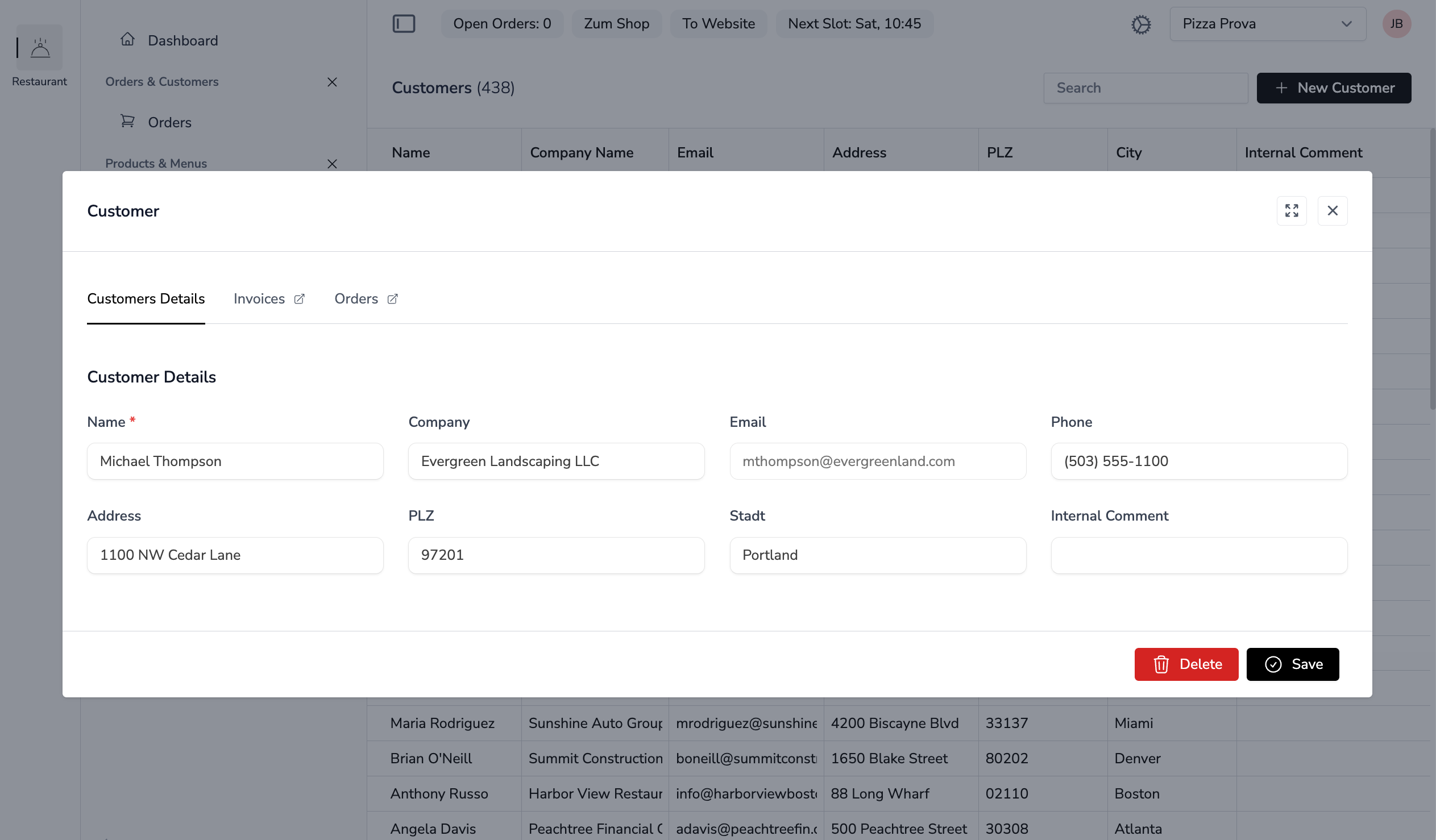
File Locations
- YAML:
app-configs/{app}/details/{name}-detail.yml - Livewire component:
app-modules/{module}/resources/views/components/{name}-detail.blade.php
YAML Configuration
Example: app-configs/inventory/details/item-detail.yml
title: Item
description: ''
tabs:
  - number: 1
    label: Master Data
  - number: 2
    label: Pricing
  - label: Stock Movements
    modalRoute: inventory.item.movements
    component: inventory::stock-movements-list
    arguments:
      itemId: $modelId
    requiresId: true
fields:
  - name: detailData.name
    label: Name
    type: text
    required: true
  - name: detailData.sku
    label: SKU
    type: text
  - name: detailData.description
    label: Description
    type: textarea
    colspan: 12
  - name: detailData.price
    label: Price
    type: currency
    tab: 2
  - name: detailData.is_active
    label: Active
    type: checkbox
    tab: 2
Detail Properties
| Property | Description |
|---|---|
title | Page title (translation key) |
description | Optional description text |
theme | Theme for the form: default, compact, numbered or any discovered theme (see Themes) |
quickCreate | Open the "new record" dialog as a narrow quick-create modal |
tabs | Array of tab definitions |
fields | Array of form field definitions |
actions | Array of action button definitions rendered above the form (see Detail Actions) |
lists | Compact lists rendered below the form (see Embedded Lists) |
positions | Column configuration of the detail's position (line item) table (see Configurable Columns) |
Note:
relations:(Relation Box) andwidgets:are PAGE concerns — they live in the optional page YAML (pages/{entity}-page.yml), not in a detail YAML. See Page View.
Tab Properties
A tab is either a panel (number: — its fields are the YAML fields with the matching tab:, plus the Blade slots below) or a link that opens something else. Tabs are rendered by <x-noerd::tabs> (resources/views/components/tabs.blade.php).
| Property | Description |
|---|---|
number | Panel index (1-based) |
label | Tab label (translation key) |
modalRoute | Named route opened as a MODAL via $modalRoute(...) instead of switching panels — for an addressable target (see Modals). The tab also carries the route's URL as href (cmd/ctrl-click, "open in new tab"); routeParameters fills the route parameters |
component | Livewire component opened as a MODAL via $modal(...) — it is never embedded inline. Also the fallback for a modalRoute that is not registered |
arguments | Arguments passed to the modal (modalRoute and component): the $modelId token resolves to the current record id, $property to any public property of the component, everything else passes through unchanged |
route | Named route the tab navigates to (wire:navigate); rendered active while the current request matches it |
routable | With component: the tab additionally links to the generic noerd.component-page route (/{prefix}/component-page/{componentName}, prefix = config('noerd.routes.prefix'), default noerd) so the component is addressable as a full page |
requiresId | Only show the tab when editing an existing record |
permission | Gate ability required to see the tab; permissionModel (optional) is passed as the ability's model argument |
viewExists | View name — the tab is hidden when that view is not registered (safe reference to an optional module) |
showIf | Reactive client-side visibility: a $wire property name (string) or {field: ..., value: ...} |
requiresId, permission and viewExists are evaluated on the server (Noerd\Support\TabVisibility::renders()), showIf becomes an Alpine x-show.
<x-noerd::tab-content> Slots
<x-noerd::tab-content :layout="$pageLayout" :modelId="$modelId" /> renders the tab bar, the <x-noerd::tab-panels> and, per panel, the YAML fields of that tab. Extra markup is added through named slots — no hand-rolled panels needed:
| Slot / prop | Description |
|---|---|
tab{n} | Markup rendered BELOW the YAML fields of panel n (<x-slot:tab2>…</x-slot:tab2>) |
prependTab{n} | Markup rendered ABOVE the YAML fields of panel n |
blockActions | The component's own buttons for the head row of the first form block (tab 1), right-aligned next to the module-contributed header actions |
| default slot | Shorthand for tab1 — a single-tab detail passes its extra markup directly |
:showBlock="false" | Skip the YAML field block entirely and render only the slots (custom, non-YAML bodies — pass :layout="[]") |
:quickCreate | Explicit override of the quick-create mode (normally read from the layout) |
<x-noerd::tab-content :layout="$pageLayout" :modelId="$modelId">
    <x-slot:prependTab1>
        <x-noerd::info-box>{{ __('Changes are applied immediately.') }}</x-noerd::info-box>
    </x-slot:prependTab1>

    <x-slot:tab2>
        <x-noerd::detail-list component="inventory::stock-movements-list" :arguments="['itemId' => $modelId]" />
    </x-slot:tab2>
</x-noerd::tab-content>
Tabs with component:/modalRoute: open a modal and render no panel; without a tabs: key the fields render as a single panel and no tab bar. In quick-create mode only the required (or quickCreate: true) fields render as one column and every slot is skipped.
Hand-Written Tabs: <x-noerd::tab>
<x-noerd::tabs> also accepts hand-written <x-noerd::tab> children when a page needs tabs the YAML cannot express. Props: tabNumber (panel switch), route + routeParameters (+ active) for navigation, modalRoute / component + arguments for a modal target, and external — a route: tab with external opens in a new browser tab (target="_blank") instead of navigating in place:
<x-noerd::tabs>
    <x-noerd::tab :tabNumber="1">{{ __('General') }}</x-noerd::tab>
    <x-noerd::tab route="inventory.item.preview" :routeParameters="['modelId' => $modelId]" external>
        {{ __('Preview') }}
    </x-noerd::tab>
</x-noerd::tabs>
<x-noerd::tabs> takes an optional actions slot rendered right-aligned in the tab bar.
Hand-Rolled Tab Panels
When a component builds its tab panels manually (instead of via <x-noerd::tab-content>), always use the generic <x-noerd::tab-panels> / <x-noerd::tab-panel> components — never a bare x-show div. They keep the modal height constant across tabs and give every panel its own scroll container. <x-noerd::tab-panel> accepts number and an optional show prop with an Alpine expression for reactive visibility on top of the tab switch:
<x-noerd::tab-panels>
    <x-noerd::tab-panel :number="1">…</x-noerd::tab-panel>
    <x-noerd::tab-panel :number="2" :show="'$wire.someFlag'">…</x-noerd::tab-panel>
</x-noerd::tab-panels>
Field Properties
Every entry of fields needs name (the property path, e.g. detailData.name), label (translation key) and type (text when omitted). The keys shared by all field types — colspan, tab, required, readonly, default, helpText, placeholder, showIf / showIfNot, theme, number, … — are listed under Field Types → Common Options; the types themselves in Field Types.
Highlighted Fields
A form can mark individual fields as carrying a value the reader did not enter themselves — a proposal from an AI agent, a value copied from another record. Two optional field keys drive it: highlight: true fills the field's control with a light amber tint and adds a tooltip on the label ("This value was proposed for you"); previousValue renders was: … under the field — what it held before the proposal replaced it.
Both are normally stamped onto the layout at runtime rather than written into the YAML: a component that renders a proposal walks its $pageLayout with Noerd\Support\LayoutFields::map() and sets the keys on the fields it filled.
$this->pageLayout['fields'] = LayoutFields::map(
    $this->pageLayout['fields'],
    function (array $field) use ($proposed): array {
        $key = Str::after((string) ($field['name'] ?? ''), 'detailData.');

        if (array_key_exists($key, $proposed)) {
            $field['highlight'] = true;
        }

        return $field;
    },
);
The fill is applied from the field wrapper in noerd::components.detail.block (a data-highlight wrapper whose descendant variants tint every input, select, textarea and rich-text editor — checkboxes excepted), so it works for every field type in every theme without an element template of its own; the label marker reads the flag out of FieldContext, exactly like helpText.
Rendering another component's form. A component may render a FOREIGN detail YAML — that is what makes a generic review screen possible: load it with StaticConfigHelper::getComponentFields('accounting::expense-detail', Expense::class) and bind the values into your own $detailData. The layout resolves by component name regardless of the session app (see componentOwnerApp()), and validateFromLayout() picks up its required: fields. Two things do NOT come along, because they live in the original component's PHP rather than its YAML: a picklistField: naming a method on that component renders empty (put such providers in the PicklistRegistry when a generic host has to render them), and its #[On('...Selected')] side effects do not run.
Relation Forms
A field name may point into a RELATED model (e.g. detailData.invoiceAddress.address_line_1): the framework hydrates the related record's values on load and persists them after every save, with zero component code. Relation forms are declared on the model via the DeclaresRelationForms contract — see Relation Forms.
Themes
The top-level theme: key selects the form layout (default, compact, numbered, or any discovered theme); a single field or nested block may override it with its own theme:, and an admin can set — and enforce — a system-wide default under Setup → System Settings. See Themes for the built-in themes, theme.yml, custom themes and element resolution.
Read-Only Rendering on Write-Denied Objects
When the object gates (see AccessHelper) deny saving the detail's $detailModel — write for an existing record, create for a new one — the whole YAML form renders read-only, in every theme. The detail block consults the hosting component's canSaveObject() (falling back to canWriteObject()) and forces readonly: true onto every field: inputs and textareas become readonly, selects, picklists, checkboxes and type: button fields disabled, upload and picker affordances are hidden, the rich-text editor is non-editable, and relation fields guard their mutators (clear(), selection) on the server.
- This is a UX affordance — the security boundary stays the
store()/delete()guards inNoerdDetail/NoerdPage. - Hand-written markup in tab slots is NOT covered: such hosts consult
$this->canSaveObject()themselves. Components withoutcanSaveObject()/canWriteObject()are never restricted. - A value that should be TEXT by design (not a disabled input) uses the display theme instead of
readonly: true.
Position Tables
Documents with line items (orders, quotes, invoices) render their positions as a table next to the YAML field grid. The table follows the active theme, and its columns are configuration.
| Component | Props | Renders |
|---|---|---|
<x-noerd::positions.section> | theme, title, description | The white card, the standard block head and a body whose padding follows the theme |
<x-noerd::positions.table> | theme, columns, actions | <table> + <thead> from the resolved columns plus the empty action header (:actions="false" omits it); a numbering theme prepends a # column |
<x-noerd::positions.row> | theme, number, colspan, details slot | A full <tbody> (so it can be a row component's root), banded with a leading number cell in a numbering theme; the optional details slot is a full-width row beneath |
<x-noerd::positions.cells> | theme, columns | One theme control per editable column (wire:model="row.{field}", wire:change="{change}"), a disabled control for readonly columns, text for array values |
<x-noerd::positions.cell> | theme, width | One <td> with the theme's padding — for the row's own cells (trash button) |
<x-noerd::positions.totals> | theme, net, gross, taxes, currency, locale | Total Net / one row per tax rate / Total Gross. taxes accepts a rate => amount map or a list of ['tax_rate' => …, 'tax_total' => …] rows, so $model->taxes passes unchanged |
<x-noerd::forms.control> | theme, type | A bare <input>/<select> styled by the theme's controlClasses; wire:*, step, disabled pass through |
Configurable Columns
Which columns a position table shows is configuration: an installation removes a column, resizes, relabels or reorders it, or adds further columns of the position model's table — in the detail YAML, without touching the module:
positions:
  columns:
    - field: quantity
    - field: unit
      label: Unit
      type: select
      optionsMethod: unitOptions
      placeholder: '-'
      width: w-28
    - field: name
      label: Name
      width: w-auto
    - field: amount
    - field: tax_amount
    - field: total_gross
    - field: delivery_date
      label: Delivery Date
      type: date
      width: w-40
The YAML is the only source of a table's columns; a module ships the table it wants as positions: block in its detail YAML. The code contributes only the columns the module's calculation depends on — the catalog (Noerd\Contracts\DefinesPositionColumns), which Noerd\Support\Positions\PositionColumnResolver merges with the YAML:
- Catalog columns can never be removed. Without
positions.columnsexactly these render, in catalog order. In the YAML a catalog column may override onlylabelandwidth(type,readonly,change,step,optionscome from the catalog); one the YAML leaves out is re-inserted after the nearest preceding catalog column that is present (or at the start). - Every other column is declared in the YAML, in YAML order. It must be a real column of the position model's table, not a system column (
id,tenant_id,created_at,updated_at,deleted_at) and not in the catalog'sforbidden()list. Keys:label(default: the headline of the field),width(defaultw-32),type(textdefault,number,date,checkbox,select), for a selectoptions(value/labellist) oroptionsMethod(aPicklistRegistryprovider returningvalue => label) plusplaceholder(the leading empty option),step,readonly. Its change handler is alwaysstore. - An invalid entry (unknown, system or forbidden field, missing
field, duplicate) is dropped with aLog::warning— a YAML mistake never breaks the page. - A column whose value is an array or JSON always renders read-only as text (scalars comma-joined; for a list of arrays/objects each item's scalar values).
The catalog lists the calculation columns and, in forbidden(), the logic-bearing fields that must never become a column:
use Noerd\Contracts\DefinesPositionColumns;
use Noerd\Support\Positions\PositionColumn;

class InvoicePositionColumns implements DefinesPositionColumns
{
    public function columns(string $modelClass): array
    {
        return [
            PositionColumn::make('quantity')->number()->width('w-20'),
            PositionColumn::make('amount')->label('Price')->number('0.01')->onChange('calcGross'),
            PositionColumn::make('tax_amount')->label('Tax rate')->number(),
            PositionColumn::make('total_gross')->label('Total')->number()->readonly(),
        ];
    }

    public function forbidden(): array
    {
        return ['invoice_id', 'total_net', 'total_tax'];
    }
}
PositionColumn is immutable (make(), label(), type() with the shorthands text(), number($step), date(), checkbox(), select($options), width(), readonly(), onChange(), step(), options(), placeholder()); the resolver marks catalog columns locked. Resolved columns travel to row components as plain arrays (toArray() / fromArray()).
Registration — once in the module provider's boot() (PositionTableRegistry); layout tooling uses the same entry to let an admin edit the columns in the UI:
app(PositionTableRegistry::class)->register('accounting::invoice-detail', InvoicePositionColumns::class, InvoicePosition::class);Detail blade — read the theme ($this->detailTheme(), on NoerdPage and therefore NoerdDetail; an unregistered theme falls back to default) and the columns ($this->positionColumns()) once and hand both to the table and to every row:
@php
    $positionsTheme = $this->detailTheme();
    $positionColumns = $this->positionColumns();
@endphp

<x-noerd::positions.section :theme="$positionsTheme" title="Positions">
    <x-noerd::positions.table :theme="$positionsTheme" :columns="$positionColumns">
        @foreach($invoice->positions as $position)
            <livewire:accounting::invoice-position
                :key="$position->id"
                :$position
                :columns="$positionColumns"
                :theme="$positionsTheme"
                :number="$loop->iteration"
            />
        @endforeach
    </x-noerd::positions.table>

    <x-noerd::positions.totals :theme="$positionsTheme" :net="$invoice->total_net"
        :gross="$invoice->total_gross" :taxes="$invoice->taxes" />
</x-noerd::positions.section>
Row component — Noerd\Traits\NoerdPositionRow provides $position, $row (attribute → value, the wire:model target), the #[Locked] $columns, $theme and $number. A row component never calls detailTheme() itself — it has no page layout:
use Noerd\Traits\NoerdPositionRow;

new class extends Component
{
    use NoerdPositionRow;

    public function mount(InvoicePosition $position, array $columns, string $theme = 'default', ?int $number = null): void
    {
        $this->initPositionRow($position, $columns, $theme, $number);
    }

    public function store(): void
    {
        // Locked, calculated fields are written by the module itself …
        $this->position->quantity = (float) $this->row['quantity'];
        $this->position->amount = (float) $this->row['amount'];
        // … every other configured column comes from the YAML.
        $this->position->fill($this->editablePositionValues());

        PriceService::calcPosition($this->position);
        $this->position->save();
    }
};<x-noerd::positions.row :theme="$theme" :number="$number" :colspan="$this->positionColumnCount()">
<x-noerd::positions.cells :theme="$theme" :columns="$columns" />
<x-noerd::positions.cell :theme="$theme" width="w-16">
<button type="button" wire:click="delete" wire:confirm="{{ __('Delete position?') }}">
<x-noerd::icons.trash />
</button>
</x-noerd::positions.cell>
</x-noerd::positions.row>initPositionRow()fillsrowfor every column (dates asY-m-d, arrays unchanged).editablePositionValues()returns only the editable, NOT locked fields of the resolved columns. Because$columnsis locked, a client cannot add a field — a tamperedrow.*key is never written.positionColumnCount()is the column count plus the action column;positions.rowadds the number column itself in a numbering theme.delete()deletes the position and dispatchespositionDeleted; override it when needed.
Detail Actions
Action buttons render as a row above the form — for record-level operations such as "Archive" or "Generate PDF". A button calls a public Livewire method of the detail component (action:), opens a modal (route: / modalComponent:) or is a link (url:).
Automatic Rendering
<x-noerd::page> renders the row as the first element of the page body whenever the component's $pageLayout carries an actions: array — a detail blade needs NO <x-noerd::detail-actions> include, adding an action is purely a YAML change. The auto-render is skipped for embedded details, quick-create dialogs and components without a $pageLayout (lists — the list-level actions: key is a different concept).
Opt out with :detailActions="false" and render the component yourself (otherwise the row would appear twice) when the layout needs custom logic, for hand-built action layouts, or for a detail that must show its actions while embedded in a hosting page (the embedded chrome renders only the slot):
<x-noerd::page :detailActions="false">
    ...
    <x-noerd::detail-actions :layout="$condition ? $pageLayout : []" :modelId="$modelId" />
YAML Configuration
title: Item
actions:
  - label: Archive
    action: archive
    heroicon: archive-box
    confirm: Archive this item?
fields:
  - name: detailData.name
    label: Name
    type: text
Action Properties
| Property | Description |
|---|---|
label | Button label (translation key) |
route | Named Route::livewire() route opened as a modal (preferred for record targets) |
modalComponent | Livewire component opened as a modal — also the fallback when route is not registered |
url | Renders the action as a plain link (<a href>) instead of a button — either a literal URL (http… / /…) or a key in the urls map (see Link Actions) |
newTab | Only with url: — defaults to true (target="_blank"). Set to false to open in the same tab |
action | Livewire method called via wire:click (used when neither route, modalComponent nor url is set) |
heroicon | Optional heroicon rendered before the label |
confirm | Optional confirmation prompt shown via wire:confirm (translation key) |
loading | Only with action: — alternate label shown while the method runs (wire:loading, translation key); the button is disabled meanwhile |
requiresId | Defaults to true — the button is hidden until the record is saved (modelId is set). Set to false to always show it |
showIf | Show the button only while a component property is truthy — or, in the object form (field: / value:), equals a value (see Conditional Actions) |
showIfNot | The negated form of showIf. Both may sit on the same action and are combined with AND |
viewExists | Optional view name — the button is hidden when that view is not registered, so YAML may reference an optional module safely |
Precedence is route: → modalComponent: → url: → action:. A route: action whose route is not registered and that has no modalComponent is not rendered at all. See Modal System for when a route is the right target.
actions:
  - label: Open Supplier
    route: inventory.supplier.detail
    modalComponent: inventory::supplier-detail   # fallback if the route is not registered
    viewExists: inventory::components.supplier-detail
    heroicon: building-office
    arguments:
      modelId: $modelId
modalComponent: needs no method on the detail component, and arguments accepts static values next to the $modelId token — enough to wire up the shipped Activity Log modal for an auditable model:
actions:
  - label: Activity Log
    heroicon: clock
    modalComponent: noerd::audit-modal
    arguments:
      modelClass: 'Noerd\Invoicing\Models\Invoice'
      modelId: $modelId
Conditional Actions
showIf / showIfNot work like the field- and tab-level conditions: the button carries an Alpine x-show bound to the component's state, so it follows a status property without a reload. The string form checks a public property (or a dotted path such as detailData.is_business) for truthiness, the object form compares against a value; both keys on one action combine with AND:
actions:
  - label: Publish
    action: publish
    showIf: hasStock
    showIfNot: isPublished
  - label: Reopen
    action: reopen
    showIf:
      field: detailData.status
      value: closed
Use it for record STATE that changes while the modal is open; requiresId ("not saved yet") and viewExists ("module not installed") stay the structural conditions. When EVERY action is conditional, the action bar hides along with its buttons.
Link Actions
A url: action renders as a link that opens in a new tab — use it for targets outside the backend (a public guest page, an external system). A record-dependent URL is computed by the detail component and exposed through a public detailActionUrls() method — the auto-rendered actions row picks it up by convention; the YAML only names the key:
public function detailActionUrls(): array
{
    return ['shopUrl' => config('inventory.shop_url') . '/items/' . $this->modelId];
}actions:
- label: Open in Shop
url: shopUrl
heroicon: arrow-top-right-on-squareAn action whose url: neither is a literal URL nor resolves through the urls map is not rendered at all, so YAML may reference a URL an installation does not provide.
Relation Box
The Relation Box (a grid of clickable tiles showing related record counts) is a PAGE feature: the relations: array lives in the page YAML (pages/{entity}-page.yml) and the <x-noerd::detail-relations> component is placed in the *-page blade. See Page View → Relation Box.
Embedded Lists
Render one or more compact lists below the form — e.g. the stock movements of an item, or one parts list per assembly of a product. Each entry renders a section heading (styled like the block title) and the list component in its compact, full-width variant (compact and disableModal are applied automatically): no header, no pagination, only the first perPage rows — use it for record-scoped lists.
| Key / prop | Description |
|---|---|
component | The list Livewire component to embed (e.g. inventory::stock-movements-list) |
arguments | Mount arguments of the list. In YAML the $modelId token resolves to the current record id and static values pass through; the Blade prop takes real values (no token resolution) |
title / description | (optional) Section heading and sub-heading (translation keys), rendered via detail.block-head |
lazy | (optional) Lazy-load the list |
wireKey | (optional, Blade only) Explicit wire:key; defaults to detail-list-{component}- + an md5 hash of the arguments. Vary it (e.g. include a timestamp) to force a re-render when the underlying data changes |
YAML-driven: <x-noerd::detail-lists>
For a fixed set of lists: one line in the Blade after <x-noerd::tab-content>, driven by the lists array of the YAML (each entry is delegated to <x-noerd::detail-list>). Nothing renders until the record is saved ($modelId is set) or while lists is empty.
<x-noerd::detail-lists :layout="$pageLayout" :modelId="$modelId" />lists:
- title: Stock Movements
component: inventory::stock-movements-list
arguments:
itemId: $modelIdBlade-direct: <x-noerd::detail-list>
For dynamic cases YAML cannot express — e.g. one list per related record in a loop:
@foreach ($product->assemblies as $assembly)
    <x-noerd::detail-list
        component="inventory::parts-list"
        :arguments="['assemblyId' => $assembly->id]"
        lazy
        :title="$assembly->name"
        :wireKey="$assembly->id . '-parts'" />
@endforeach
Livewire Component
A detail component declares its model as public $detailModel and its URL alias as public ?string $detailPrimary — everything else (mounting, store(), delete()) comes from the NoerdDetail trait.
$detailPrimary is MANDATORY for every model-backed detail (a missing declaration throws on mount). It binds $modelId (int|string|null, declared by NoerdPage) to the entity-scoped query parameter (?itemId=5) — never redeclare $modelId or add a #[Url] attribute yourself. The binding is applied by the trait (queryStringNoerdPage()) and automatically skipped when the component is mounted embedded: true, so a hosting page can own the same URL parameter without conflicts. Set detailPrimary only as a literal property default (never in mount()): the modal system probes a fresh instance to collect the URL params to clear on close. Components without $detailModel (dashboards, always-embedded children) simply leave it null — no URL binding.
Example: item-detail.blade.php
<?php

use Livewire\Component;
use Noerd\Traits\NoerdDetail;
use Vendor\Inventory\Models\Item;

new class extends Component {
    use NoerdDetail;

    public $detailModel = Item::class;

    public ?string $detailPrimary = 'itemId';
}; ?>

<x-noerd::page>
    <x-slot:header>
        <x-noerd::modal-title>{{ __('Item') }}</x-noerd::modal-title>
    </x-slot:header>

    <x-noerd::tab-content :layout="$pageLayout" :modelId="$modelId" />

    <x-slot:footer>
        <x-noerd::delete-save-bar :showDelete="isset($modelId)"/>
    </x-slot:footer>
</x-noerd::page>
The trait defaults hydrate $detailData from $detailModel on mount, validate via validateFromLayout() and persist $this->writableDetailData($modelClass) on store(): with a $modelId the record is resolved through the scoped query (find()) and updated (fill()->save()) — an id that does not resolve for this user (another tenant's, a deleted or an invented one) stores NOTHING, because $modelId is URL-bound and therefore client-controlled. Without a $modelId the record is created. delete() deletes the record and closes the modal. writableDetailData() reduces the client-controlled $detailData to the top-level keys the detail YAML on disk binds (detailData.*, recursing into blocks), strips the relation-form keys (see Relation Forms) and always drops id, tenant_id, created_at and updated_at — a crafted request can never inject columns the form does not show. Both store() and delete() are guarded by canSaveObject() / canDeleteObject().
Success indicator. The transient "Successfully saved" feedback the save bar shows left of its buttons is its own component, <x-noerd::success-indicator :message="..." />, bound to the boolean showSuccessIndicator property (another name via property=). It fades out and resets the property after three seconds. A component with a save action that does not use the save bar — an editor modal, a screen with custom footer buttons — renders it in its footer instead of a status banner and sets the property to true after persisting.
Custom Store / Delete Logic
Only when the persistence deviates from the default, override store() and/or delete(). A custom store() keeps the guard and ends with finishStore($model) (which runs storeProcess() and reports the saved record to a hosting page); a custom delete() ends with closeModalProcess($this->getListComponent()):
new class extends Component {
    use NoerdDetail;

    public $detailModel = Item::class;

    public ?string $detailPrimary = 'itemId';

    public function store(): void
    {
        if (! $this->canSaveObject()) {
            return;
        }

        $this->validateFromLayout();

        $payload = $this->writableDetailData(Item::class);

        // Never updateOrCreate(['id' => $this->modelId], …): $modelId is client-controlled, and
        // an id the scoped query cannot resolve must not end up as an INSERT with that id.
        if ($this->modelId) {
            $item = Item::find($this->modelId);

            if (! $item) {
                return;
            }

            $item->fill($payload)->save();
        } else {
            $item = Item::create($payload);
        }

        $item->tags()->sync($this->tagIds);

        $this->finishStore($item);
    }
};initDetail(), finishStore(), storeProcess() and writableDetailData() are protected — they are called from inside the component, never from outside.
The same applies to mount(): override it only for extra logic and call $this->initDetail() first. Typical additions:
setPreselect('customer_id', $id)/preselect('customer_id')— the sharedlistFilterssession bucket: a page seeds it so a related list opens pre-filtered, and a new record adopts the value by calling the matchingcustomerSelected()method when it existsopenRelationDetail($fieldName)— open the record adetailDataforeign key points at; the target route and component are read from the field's registered relation definition in the layout (route first, component as fallback)
Initial field values are not such a case: they are configuration and belong in the YAML (default:, or the first option of a select) — see Default Values. The trait applies them generically, also to a custom mount() that replaces $detailData wholesale.
Key Concepts
- Trait:
NoerdDetailprovides$detailData(array, the form binding),$modelId,$pageLayout,$relationTitlesandmount()/store()/delete()— override only for custom behavior - $detailModel:
public $detailModel = Model::class;is required on every model-backed detail — it drives mounting, the defaultstore()/delete(), and the header actions - validateFromLayout(): Validates against the
required:flags of the YAML (plus relation-form rules) - getListComponent(): Derives the list refreshed on close from the component name (
item-detail→items-list, namespace kept); declareprotected string $listComponent = 'inventory::stock-list';when the list does not follow the plural convention (overriding the method stays possible for a dynamic target and wins over the property) - componentName(): The name the YAML, session keys and trait events resolve by (Livewire's component name,
NoerdComponentShared);getDetailComponent()is the hook for a component that renders another component's detail YAML — declareprotected string $detailConfigComponent = 'item-detail';(NOT$detailComponent, which on lists names the modal a row click opens). The trait declares neither property; keep themprotected - The Eloquent model is never stored as a property of a detail or page component (the one exception is a position row:
NoerdPositionRow::$position) - tenant_id: Do not set
tenant_idmanually instore(). Models using theBelongsToTenanttrait havetenant_idassigned automatically on creation. - Extension slots:
<x-noerd::detail-slot name="item-below-form" :modelId="$modelId" />marks a position where other modules mount their own Livewire components — see DetailSlotsRegistry
Further UI Components
<x-noerd::toolbar :buttons="[...]">— a horizontal action/status bar. Each entry is an array withlabel,action, optionalheroicon,confirm,disabled;type: separatorrenders a divider,type: statusa colored status chip (variant: success|warning|neutral).<x-noerd::code-snippet label="..." language="blade">— renders the slot content as a dark code panel with a copy button (embed codes on settings pages).<x-noerd::help-tooltip text="...">— the question-mark tooltip used byhelpText, for custom labels.<x-noerd::dashboard-card title="..." heroicon="..." :value="$count" />— the square tile of app dashboards.routeopens a route modal,componenta component modal (the fallback when the route is not registered),argumentsgo to either,rewriteUrl: falsekeeps the URL when the card opens a filtered list,externalmakes it a plain link in a new tab,image/heroiconset the icon,valuerenders a figure below the title,backgroundoverrides the tile color.<x-noerd::action-message on="saved">Saved.</x-noerd::action-message>— a transient confirmation line: listens for the Livewire event named inon, fades out after two seconds.<x-noerd::rich-text :content="$text" />— renders the (tenant-editable) HTML produced by<x-noerd::forms.tiptap>throughNoerd\Support\HtmlSanitizer: the editor's tag subset survives, every other element is unwrapped to its text,script/style/iframe/form elements are removed with their content, attributes outside the allow-list (so allon*handlers) are stripped andhref/srcmay only use http, https, mailto or tel.<livewire:noerd::dropzone wire:model="files" :rules="[...]" multiple />— a drag-and-drop file upload.filesis the#[Modelable]array the host binds to, one entry per file withname,extension,size,mime_typeand the upload itself under_original.rulesare the Laravel validation rules applied per file (mimes:pdf,jpg,max:2048— they also produce theacceptattribute and the displayed size limit),multipleallows more than one file. It dispatchesfiles-updated(with the currentfilesarray) after every add or remove andfiles-clearedafterclearFiles().The array is a public Livewire property, so every scalar in it is client-controlled — it deliberately carries NO file path. Get the upload back ONLY through
Noerd\Support\DropzoneFile::resolve($file)(?UploadedFile,nullfor an entry that is not a real, still-present upload) orDropzoneFile::resolveAll($files);DropzoneFile::stream($upload)opens a read stream. They trust nothing but the signed_originalreference.
Upload limits
The browser posts a whole selection to Livewire in ONE request, and PHP refuses a request holding more than max_file_uploads files (20 by default) or more than post_max_size bytes — before any application code runs, with nothing in the log and nothing on the screen. The dropzone therefore reads both limits (Noerd\Support\UploadLimits) and uploads a larger selection in consecutive batches that fit (Uploading 20 of 40...); files-updated fires once per batch rather than once per selection. Nothing is configurable and nothing in a consuming module has to change — max_file_uploads is a PHP-level limit no validation rule can raise. A batch the server still refuses (a proxy limit, a failed request) surfaces as a message on the dropzone.
Naming Conventions
- Lists:
{plural}-list.blade.php(e.g.,customers-list.blade.php) - Details:
{singular}-detail.blade.php(e.g.,customer-detail.blade.php) - Components live directly in the
components/folder by default. Nested component names are supported (e.g.inventory::stock.movements-list): DETAIL YAMLs map the dots to subfolders (details/stock/movement-detail.yml), LIST YAMLs always stay flat inlists/— the dot segments are ignored for lists (see List View)
Next Steps
- Field Types - All available field types and their options
- Page View - Page chrome, relations, widgets around a detail form
- Creating Modules - Build independent modules