Create a List View
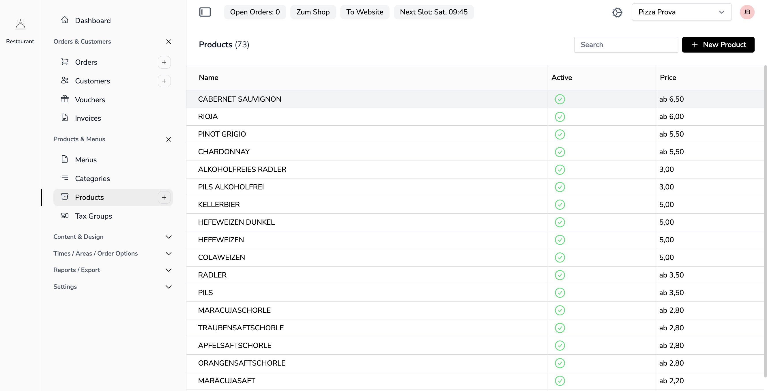
Lists display data in a table format with search, pagination, and actions.
File Locations
- YAML:
app-configs/{app}/lists/{name}-list.yml - Livewire component:
app-modules/{module}/resources/views/components/{name}-list.blade.php
List YAML files always live DIRECTLY in lists/ — never in subfolders. A nested Livewire component name (dots from a blade subfolder, e.g. booking::bookings.types-list) still resolves its config by the flat file name (lists/types-list.yml); the subfolder segments are ignored for lists. Layout overrides key off the same flat name. (Detail YAMLs keep their dot-to-subfolder mapping.)
The config is resolved against the app folders the tenant may use — current app first, then the other granted apps, then their module sources. A namespaced component (communication:: communications-list) additionally falls back to its OWN module's app folder (app-configs/communication/), so a module reached from another app — linked from its navigation, embedded in its detail, or opened as a modal from one of its tabs — still finds its title, columns and fields even when the tenant was never granted that module as an app. The fallback is searched last, so a granted app's own copy always wins. The same applies to detail and page YAMLs.
Example YAML Configuration
Example: app-configs/inventory/lists/items-list.yml
title: Items
actions:
  - label: New Item
    route: inventory.item.detail
disableSearch: false
columns:
  - field: name
    label: Name
    width: 12
    type: text
  - field: sku
    label: SKU
    width: 8
  - field: category
    label: Category
    width: 10
  - field: price
    label: Price
    width: 6
    type: currency
  - field: stock
    label: Stock
    width: 6
    type: number
  - field: is_active
    label: Active
    width: 4
    type: bool
List Properties
| Property | Description |
|---|---|
title | Page title (translation key) |
description | Optional description text under the title |
actions | Array of action buttons (see Actions below) |
disableSearch | Disable the search functionality |
showSummary | Show or hide the summary row in the table footer (default: true) |
showLineNumbers | Prepend an Excel-style row-number column (restarts on every page) |
multiSelect | Enable the checkbox column and bulk-action bar on this list page (see Multi-Select & Bulk Actions below) |
bulkActions | Array of bulk-action buttons shown when one or more rows are selected (see Multi-Select & Bulk Actions below) |
searchableColumns | Restrict the search to specific fields (see List Search) |
notSortableColumns | Fields whose header must not be sortable (see List Search) |
displayMode | table (default) or grid — render the rows as a card grid instead of a table (see Grid Mode below) |
gridColumns | Cards per row in grid mode at the largest breakpoint, 1–6 (default: 4) |
columns | Array of column definitions |
Column Properties
| Property | Description | Default |
|---|---|---|
field | Model attribute name | |
label | Column header (translation key) | |
width | Relative column weight — widths are normalised across all columns (a column with width: 2 is twice as wide as one with width: 1) | 1 |
minWidth | Minimum width in pixels (min-width) | none |
align | Text alignment (left, center, right; number/currency auto-align right) | left |
type | Display type (see Column Types below) | text |
options | value/label pairs for the badge type (see below) | |
readOnly | Renders the cell input of the text, id, number and currency types read-only. Set to false to allow inline editing (see Inline Editing below) | true |
wireModel / wireModelField / live | For the checkbox type: the array property the checkbox binds to, an optional sub-key, and whether the binding is wire:model.live (see Inline Editing below) | / / false |
translatable | Marks the column as language-dependent — the cell gets a subtle blue background so an editor sees that the value belongs to the selected language (see Languages) | false |
action | Livewire method called on cell click (receives the row id) | openListRow |
actions | Array of row actions rendered as a dropdown in this column — entries support label, route, modalComponent, action, confirm, heroicon | |
wireClick / wireClickField | For colored_text: custom wire:click method plus the row field passed as its argument | / id |
Column Types
A column type looks the same in every rendering mode: the table cell, the card grid and the widget list format date, datetime, number and currency through the same FormatHelper / CurrencyHelper calls (grid and widget via Noerd\Support\ListCellFormatter) and resolve badge labels the same way. The CSV export writes amounts without the currency symbol.
| Type | Description |
|---|---|
text | Default. Standard text display |
date | Date in the user's locale (03.09.2026 for de-DE, 09/03/2026 for en-US) via FormatHelper::date() |
datetime | Date + time in the user's locale (03.09.2026 14:05 for de-DE, 09/03/2026 2:05 PM for en-US), see Currency, Numbers & Dates |
number | Right-aligned number in the user's locale, at most 2 decimals (FormatHelper::number()) |
currency | Right-aligned amount in the tenant currency, written in the user's locale (Noerd\Helpers\CurrencyHelper::format()) |
id | Clickable ID link |
bool (alias boolean) | Read-only icon: green checkmark (true), red circle (false) |
inversebool | Read-only icon: green checkmark when true, nothing when false |
checkbox | Editable checkbox bound to a component property via wireModel (see Inline Editing below) |
badge | Neutral badge; the raw value is translated to a label via the column's options (value/label pairs). Columns mirroring a paired detail type: select field get this automatically |
badge_with_text | Badge with optional text — the row value is an array with badge, text and an optional variant (primary default, danger, success, warning, neutral) |
relationBadge | Badge showing the display title of a foreign-key value (resolved via the registered relation types) |
customAttribute | Value from the custom_attributes JSON column, normalized for display (translatable arrays are resolved to the active language) |
colored_text | Text with optional color classes; the row value may be an array with text, class, prefix, prefixClass, icon keys |
relation_link | Clickable chip that opens the related record as a modal: route (preferred) and/or modalComponent (fallback) name the target, idField the row field holding its id (default id), idParam the argument it is passed as (default modelId, in both modes). Without a resolvable target the value renders as plain text |
Automatic typing: Columns without an explicit type are typed from the database schema (boolean → bool, numeric → number, date/datetime → matching type), and columns whose field mirrors a type: select field in the paired detail YAML ({x}-list → {x}-detail) render as translated badges automatically. An explicit type or own options always wins.
Example:
columns:
  - field: name
    label: Name
    width: 30
    type: text
  - field: start_date
    label: Start Date
    width: 15
    type: date
  - field: is_active
    label: Active
    width: 10
    type: bool
  - field: is_emergency
    label: Emergency
    width: 10
    type: inversebool
Action columns
Four field names are magic: a column whose field is one of them renders a control instead of a value, so an action column needs no type. The row id is always passed as the single argument.
field | Renders | Companion keys |
|---|---|---|
action | The row's kebab menu on hover — or, without actions:, the plain pencil button that opens the row | actions: (see below) |
selectAction | A primary button with a plus icon, right-aligned — the "pick this row" button of a picker | label:, action: |
deleteAction | A danger button behind a confirmation prompt | label:, action: |
secondAction | A secondary button | label:, action: |
action:is the public method called on the list component,{{ $action }}($id). It defaults toopenListRow— the generic row opener — so a button column withoutaction:behaves like a row click.label:is the button caption (translation key). Give every button column one; theactioncolumn needs none.
The action column's dropdown — each entry of actions: mirrors the detail actions precedence: route: opens a route modal for the row record, modalComponent: is the fallback, and action: calls a method on the list component. An entry with a route: that is not registered and no modalComponent: is skipped, so YAML may reference an optional module safely.
| Key | Description |
|---|---|
label | Entry caption (translation key) |
route | Named route opened as a route modal with modelId = the row id |
modalComponent | Component modal opened with modelId = the row id; also the fallback for an unregistered route |
action | Method called on the list component as method($id) (used when neither route nor modalComponent is set) |
heroicon | Optional icon before the label |
confirm | Optional confirmation prompt via wire:confirm (translation key); action: entries only |
columns:
  - field: email
    label: Email
  - field: name
    label: Name
  - field: action
    actions:
      - label: Login as user
        heroicon: user
        action: loginAsUser
        confirm: Do you really want to log in as this user?
Put the action column last — it right-aligns its control in the cell.
Inline Editing
Cells are read-only by default. Two column types opt into editing:
text/idcells withreadOnly: falsedispatchupdateRow($id, $column, $value)on the list component viawire:change.NoerdList::updateRow()is a deliberate no-op — a list opts into persistence by overriding it with the same signature:phppublic function updateRow(int|string|null $id = null, ?string $column = null, mixed $value = null): void { // The column name arrives from the client — only accept what is meant to be editable. if (! in_array($column, ['name', 'sku'], true)) { return; } Item::query()->whereKey($id)->update([$column => $value]); }type: checkboxbinds the cell to an array property of the component:wireModelnames the property, the row id is the key, and an optionalwireModelFieldaddresses a sub-key (permissions.{id}.read). Withlive: truethe binding iswire:model.live, otherwise it is deferred until the next request. A row that does not carry the column's field renders no checkbox.yamlcolumns: - field: read label: Read type: checkbox wireModel: permissions wireModelField: read live: true
bool and inversebool cells are read-only icons — use checkbox for a toggleable boolean.
Livewire Component
A list component declares its model as public $listModel and its detail target as public ?string $detailRoute (preferred) and/or public $detailComponent — everything else (query, modal opening, mounting, request handling) comes from the NoerdList trait.
Example: items-list.blade.php
<?php

use Livewire\Component;
use Noerd\Traits\NoerdList;
use Noerd\Inventory\Models\Item;

new class extends Component {
    use NoerdList;

    public $listModel = Item::class;
    public ?string $detailRoute = 'inventory.item.detail';
    public $detailComponent = 'inventory::item-detail';
};
?>

<x-noerd::page>
    <x-noerd::list/>
</x-noerd::page>
The trait defaults build the query via listQuery($this->listModel) (which applies search, sort and the Excel-style column filters from the YAML config) and open the detail as a modal on row click.
$detailRoute wins when the named route is registered: the record opens as a modal AND the browser URL is rewritten to /{app}/{entity}/{id}?modal=true, so the link is shareable and a reload reopens the record over the previously visited page. $detailComponent stays as the fallback — keep both, so a list may reference a detail route owned by an optional module. See Modal System.
Row click always opens the record by route
Declaring $detailRoute is not optional: every list whose rows open a record opens it by route, so the address bar points at the record after the click. Never override listAction() to open a component modal, a list narrowed by the clicked row, or anything else that has no URL — see Route modal or component modal?. Component modals opened from a list row are reserved for pickers (selectAction, see Multi-Select) — a selection is not a URL.
A record without an editable form (mirrored or read-only data such as a synced client or an import log line) still gets its own *-detail: the detail YAML marks the fields readonly: true and embeds the related rows through lists: (the narrowed list the row used to open directly), the component renders no save bar and overrides store() / delete() as no-ops, and the module registers Route::livewire('{app}/{entity}/{modelId}', …) for it.
Custom Query Logic
When the list needs its own query (eager loads, extra wheres, row transformations), override listData() — keep $listModel declared and still build the query via listQuery($this->listModel):
new class extends Component {
    use NoerdList;

    public $listModel = Item::class;
    public ?string $detailRoute = 'inventory.item.detail';
    public $detailComponent = 'inventory::item-detail';

    public function listData(): array
    {
        $rows = $this->listQuery($this->listModel)
            ->whereNotNull('published_at')
            ->with('category')
            ->paginate($this->perPage);

        foreach ($rows as $row) {
            $row->price_preview = CurrencyHelper::format($row->grossPrice());
        }

        return $this->buildList($rows);
    }
}; ?>
listQuery() applies search, sort and the Excel-style column filters, and eager-loads the relations of dotted relation columns (category.name) itself. It does NOT apply the header dropdown filters (listFilters) — a list with such filters calls $this->applyListFilters($query) on the builder itself (see List Filters). A list that renders a YAML under another name passes it to both calls: listQuery($model, 'other-list') and buildList($rows, 'other-list').
Never leave a custom query in with() once $listModel is declared: the generic trait features (row click, select-all, bulk delete) resolve the list via listData() and would operate on the wrong rows. Extra view data (e.g. a footer summary) stays in a slim with() that returns only the extra keys — share the query between listData() and with() via a private helper method:
private function filteredQuery(): Builder
{
    return $this->listQuery($this->listModel)
        ->when($this->categoryId, fn ($query) => $query->where('category_id', $this->categoryId));
}

public function listData(): array
{
    return $this->buildList($this->filteredQuery()->paginate($this->perPage));
}

public function with(): array
{
    return [
        'summary' => [
            'name' => __('Total'),
            'stock' => $this->filteredQuery()->toBase()->sum('stock'),
        ],
    ];
}
The summary row only renders when the view hands it to the list component — keys are column fields, currency columns are formatted, everything else prints as is (showSummary: false in the YAML hides the row):
<x-noerd::page>
    <x-noerd::list :summary="$summary" />
</x-noerd::page>
Key Concepts
<x-noerd::list />renders the table; theNoerdListtrait provides every property and method.- Deep links:
?{entity}Id=5opens that record's modal over the list,?create=1the create modal.mountList()reads them once on mount; the parameter name derives from the component name (items-list→itemId). - Object permissions: Read/write/delete denial via the optional
noerd.object-*gates (see Permissions) hides rows, header actions and the delete bulk action. The permission target is the model resolved bylistQuery()/ the declared$listModel. A repository-backed list without$listModeldeclares it explicitly —public ?string $objectPermissionModel = Item::class;— otherwise it stays unrestricted.
Component API
| Member | Purpose |
|---|---|
$listModel | The Eloquent model backing the list — required for the trait defaults and the module-contributed header actions |
?string $detailRoute / $detailComponent | Named detail route a row click opens (URL rewritten) and the component fallback when that route is not registered |
listData() | Builds the list; override it for custom queries, always ending in return $this->buildList($rows); (buildList() generates the list configuration from the YAML) |
listAction(mixed $modelId = null, array $relations = []) | Opens $detailRoute (else $detailComponent) as a modal with ['modelId' => $modelId, 'relations' => $relations]; override it only to add modal arguments |
?string $filter (#[Url]) | Free-form list filter carried as ?filter=…. The trait never reads it — a list seeds its own listFilters or query from it in mount() |
string $listActionMethod | Public method a row click dispatches to (default listAction; pickers pass selectAction). openListRow() only ever calls PUBLIC methods by this name |
selectAction($modelId) | Picker row action: dispatches noerdRelationSelected and {entity}Selected (items-list → itemSelected) with ($modelId, $context), then closeTopModal |
updateRow($id, $column, $value) | Inline-editing hook — a no-op unless overridden (see Inline Editing) |
refreshList() | Re-renders the list ($refresh). Listens to refreshList-{name}, where {name} is listConfigComponent() — by default the full component name incl. namespace (inventory::items-list) — and to the name after the last dot; a detail's closeModalProcess() dispatches it for its paired list |
exportCsv() | Streams the CSV download (see CSV Export) |
getAllowedListFilterColumns() (protected) | Whitelist of header listFilters keys (see List Filters) |
mountList() / loadListFilters() (protected) | Mount-time setup (per-page, filters, view, sort, deep links) — call mountList() first in a custom mount() |
componentName() (protected) | The name the YAML config, session keys and events resolve by — Livewire's component name; override only in unregistered test fixtures |
listConfigComponent() (protected) | The name the list YAML resolves under — declare protected string $listConfigComponent = 'other-list'; when a component renders another list's YAML |
getListEntity(), getSelectEvent(), getDeepLinkParam() (protected) | The singular entity (items-list → item), the picker event (itemSelected) and the deep-link parameter (itemId), all derived from the component name — configure them with protected string $listEntity / $selectEvent / $deepLinkParam |
The naming hooks resolve in a fixed order: a method override wins over the configured property, the property over the derivation from the component name. Declare the properties protected — the trait declares none of them itself (a class redeclaring a trait property with another default is a PHP fatal), and a public one would be client-writable:
    // Renders the YAML of items-list under another component name
    protected string $listConfigComponent = 'items-list';

    // 'inventory-stock-list' would otherwise derive 'inventoryStock'
    protected string $listEntity = 'item';
Default Sorting
Default sorting is configured in the list YAML — never in the component:
title: Items
defaultSort:
  field: name
  direction: asc   # optional, desc when omitted
mountList() applies the YAML default whenever the user has not sorted the list yet; a sort the user picks in the header is persisted per list in the session and always wins over the YAML default. Alternate list views (--{key}.yml) are complete standalone configs, so each view may bring its own defaultSort.
Without a defaultSort key, lists sort by id descending. There is no component API for default sorting: never set $sortField / $sortAsc directly and never override mount() for sorting.
See List Search for more details on search and sorting.
Actions
Header buttons come from the actions array of the list YAML; no actions key means no button.
actions:
  - label: Import
    action: openImportModal
    heroicon: arrow-up-tray
    style: secondary
  - label: New Item
route: inventory.item.detail| Property | Description |
|---|---|
label | Translation key for the button text |
route | Named route opened as a modal — use it for the "New …" button: it opens the detail route and writes /inventory/item/new?modal=true into the address bar |
arguments | (optional, with route) Arguments passed to the modal |
action | Livewire method called when no route is given. action: listAction is the component-based "New …" for a list whose detail has no route |
heroicon | (optional) Heroicon name for the button icon |
style | (optional) secondary; buttons are primary by default and render side by side |
shortcut | (optional) Keyboard shortcut of this button. The FIRST action defaults to noerd.keyboard_shortcuts.new_entry (n), further actions have none (see Keyboard Shortcuts) |
A custom action method matches the listAction() signature:
use Noerd\Facades\Noerd;

public function openImportModal(mixed $modelId = null, array $relations = []): void
{
    Noerd::modal('inventory::stock-import-modal');
}
Where the controls render: the standard header is two rows — title row (title, record count, every button) and filter row (search, filters, registry actions, pagination); see List Filters → Header layout. A component with its OWN <x-slot:header> (e.g. a list nested in tab panels) wraps its title in <x-noerd::modal-title> and gets the same controls injected top right in one row (noerd::components.table.list-controls) — never hand-roll a search field or action buttons in a list header. Two props tune the injection:
| Prop | Description |
|---|---|
:listControls="false" | Suppresses the injection (for headers without a real list behind them) |
listControlsShow | Alpine expression gating the controls' visibility, e.g. currentTab === 2 |
Pagination
Every list is paginated (WithPagination, page state kept out of the URL). The navigation — the summary 1-50 of 150 plus icon-only previous/next buttons — is ONE partial (noerd::components.table.list-pagination-nav, expecting a $paginator) rendered twice: in the right group of the header's filter row (only while the list has rows) and in the pagination footer (noerd::pagination). The two can therefore never drift apart; never render page buttons by hand.
The rows-per-page select lives in the footer only. Its options are 10, 25, 50, 100, 200 — never above NoerdList::MAX_PER_PAGE (200), which clampPerPage() enforces on every update and on the session-restored value in mountList(). The chosen size is persisted per list in the session (listPerPage.{component}).
Multi-Select & Bulk Actions
Lists support a generic multi-select mode: a leading checkbox column plus a footer bar that acts on the ticked rows. The selected ids are tracked in the generic public array $selectedRecordIds property on the NoerdList trait — never re-implement this per list. There are two flavours.
1. Bulk-action page
Set multiSelect: true in the list YAML to show checkboxes on the list page. Row clicks still open the detail (only the checkbox ticks a row). When one or more rows are selected, a footer bar renders the buttons from the YAML bulkActions array.
title: Tasks
multiSelect: true
bulkActions:
  - label: Assign to
    action: assignSelected            # list-specific method on the component
    heroicon: user-plus
    style: secondary
  - label: Delete
    action: deleteSelected            # generic NoerdList method — works for any list
    heroicon: trash
    style: danger
    confirm: Delete the selected entries?   # optional: shown via wire:confirm
columns:
  - field: title
    label: Title
bulkActions properties:
| Property | Description |
|---|---|
label | Button text (translation key) |
action | Livewire method called on the list component (required) |
heroicon | (optional) Heroicon name for the button icon |
style | (optional) secondary or danger. Default is primary |
confirm | (optional) Confirmation prompt (translation key) shown via wire:confirm |
Generic vs. list-specific actions:
deleteSelected()lives inNoerdList— it deletes every selected id through the tenant-scoped query (firing model events, so observers/auditing still run). Wire it up purely from YAML; no per-list method is needed.List-specific actions are public methods you add to the list component. They read the ticked ids from
$this->selectedRecordIds. Example — open the task-create modal for the selected records:phpuse Noerd\Facades\Noerd; public function assignSelected(): void { Noerd::modal('inventory::assign-category-modal', [ 'itemIds' => $this->selectedRecordIds, ]); }
After a bulk action that should clear the selection (e.g. opening a follow-up modal that finishes the job), reset it in a listener so the checkboxes clear:
use Livewire\Attributes\On;

#[On('categoryAssigned')]
public function onCategoryAssigned(): void
{
    $this->selectedRecordIds = [];
}
2. Picker (return a selection to an opener)
Open any list as a modal with multiSelect and returnsSelection to use it as a record picker. In picker mode a row click ticks the row, the top "New …" action is hidden, and the footer shows Cancel / Apply selection instead of the bulk actions.
Noerd::modal('inventory::items-list', [
    'multiSelect' => true,
    'returnsSelection' => true,
    'selectedRecordIds' => $this->selectedIds,   // pre-tick the current selection
    'context' => 'bundleItems',                  // disambiguates the result event
]);
On confirm the list dispatches recordsSelected with ids and context; the opener listens and filters by its context:
#[On('recordsSelected')]
public function recordsSelected(array $ids, mixed $context = null): void
{
    if ($context !== 'bundleItems') {
        return;
    }

    $this->selectedIds = array_values(array_map('intval', $ids));
}
Generic API on NoerdList
| Member | Purpose |
|---|---|
bool $multiSelect | Enable the checkbox column (prop, or multiSelect: true in YAML) |
bool $returnsSelection | Picker mode — row click ticks, footer is Cancel / Apply selection |
array $selectedRecordIds | The ticked ids |
toggleRecordSelection($id) | Toggle one row (wired to the row checkbox and, in picker mode, the row click) |
toggleSelectAllVisible() | Toggle every row on the current page (the header checkbox) |
confirmRecordSelection() | Dispatch recordsSelected + closeTopModal (picker footer) |
deleteSelected() | Generic bulk delete of the selected records |
Notes:
- Multi-select is always off in compact/embedded lists — checkboxes only appear on full pages and in pickers, never in a list embedded inside a detail view.
- The checkbox's checked state is part of its
wire:key, so the DOM is recreated when the selection changes — this guarantees the checkboxes clear after a bulk action (a plain morph can leave a user-toggled checkbox visually checked). - The footer (picker confirm bar vs. bulk-action bar) is decided by
returnsSelection: when set, the confirm bar wins; otherwise the YAMLbulkActionsrender once at least one row is selected.
Compact Mode (Embedded Lists)
Use compact mode when embedding a list inside another component — for example a related list rendered below the form of a detail view. In compact mode the list renders only the table and hides:
- the list header (title, search field and action buttons such as "New …")
- the inline list description
- the pagination footer (the
1-50 of 150summary, the per-page select and the page buttons)
compact is a public property on the NoerdList trait, so it works exactly like disableModal — just add it as an attribute on the embedded Livewire component.
For detail views, don't wire this up by hand. Use the generic
<x-noerd::detail-lists>component instead — it renders the heading, the breakout wrappers and the compact list from alistsarray in the detail YAML. See Embedded Lists in Detail Views.
The low-level flag (used internally by <x-noerd::detail-lists>):
<livewire:inventory::items-list
    wire:key="category-items-{{ $modelId }}"
    disableModal
    compact
    :categoryId="$modelId" />
Notes:
- The behaviour is generic in
noerd::components.list— never duplicate it per module. Only the firstperPagerows show, so use it for narrowly-scoped lists (records of the current record). - A list embedded with
disableModalbreaks out of its host by--noerd-page-inset; the noerd page body declares itspx-6as that inset, so a list nested anywhere in a detail or page (tab panel,<x-noerd::detail-list>, widget) sits flush with the page edge — never re-pad it by hand. A host that wants the list to stay inside (the widget card) resets[--noerd-page-inset:0px]. - A full page nested inside another noerd page (a complete list with its own header in a detail tab) is detected automatically: it takes neither the modal chrome nor the viewport height of the outer page.
disableModalnever needs to be passed to<x-noerd::page>in the component's own view — the page reads it from the Livewire component; an explicit attribute still overrides it.
Multiple List Views (View Switcher)
A list can ship multiple YAML views — alternate configurations of the same list (different columns, title, actions). When at least two views exist, the list title turns into a dropdown button (title + record count + chevron) that lets the user switch the active view, similar to Salesforce list views.
Naming convention — sibling files in the same lists/ folder, suffixed with --{key}:
app-configs/inventory/lists/
├── items-list.yml              # the default view
├── items-list--low-stock.yml   # view "Low Stock"
└── items-list--archived.yml- The view key is the suffix after
--(e.g.low-stock);--is therefore reserved as the view separator and must not appear in list names themselves. - Each view file is a complete standalone list config (title, columns, actions, …) — nothing is merged from the base file.
- Views may be project-only: an
items-list--low-stock.ymlin the project'sapp-configs/without a module copy is fine. Within one app a project file shadows a module-source file with the same view key.
Cross-app enumeration — the dropdown lists the views of EVERY app allowed for the tenant, not just the current app. A list name that exists in several apps (items-list in inventory and warehouse) yields one entry per app, each labelled with its source app (the TenantApp title, Setup for the setup folder) at reduced opacity — "Items (Warehouse)". The entry's own label is the view file's translated title.
- Current-app entries use plain view keys (
default,low-stock), other apps' entries composite{app}::{key}keys (warehouse::low-stock) —::is therefore reserved too. Ordering: current app first;defaultleads each app group, the remaining variants alphabetical. - Selecting another app's view renders that app's YAML (
StaticConfigHelper::getListConfigForApp()); the session's selected app is NOT changed.
Behaviour:
- The switcher renders only with ≥2 entries (across all apps), never in compact/embedded lists or pickers.
- The selected view is remembered per list in the session (
listView.{component}, composite for another app's view) and mirrored in the URL as?view={key}—defaultfor the base view, composite keys written{app}--low-stock(keeps%3A%3Aout of the URL). On page load the URL wins over the session; an unknown or removed view silently falls back to the default. Single-view lists never carry the param; compact lists and pickers never read or write it. - The whole config is swapped, so the view's own
searchableColumns,actions,notSortableColumns,defaultSortand column types apply. DB-driven layout overrides key per view file (items-list--low-stock), app-agnostic — a restriction onlow-stockalso hides every other app's{app}::low-stockentry.
Generic API:
| Member | Purpose |
|---|---|
?string $listView | Active plain view key (null = base YAML) on the NoerdList trait |
?string $listViewApp | Source-app folder of the active view (null = current app) |
?string $listViewParam | URL-bound (#[Url(as: 'view')]) key of the active view incl. 'default'; composite keys use -- (warehouse--low-stock); null = single-view/embedded list |
switchListView(string $key) | Switch and persist the active view ('default' = base YAML; accepts composite keys) |
availableListViews (computed) | ['{viewKey}' => ['key' => …, 'app' => …, 'appLabel' => …, 'title' => …], …] |
StaticConfigHelper::getListViews($component) | The underlying cross-app discovery helper |
StaticConfigHelper::getListConfigForApp($app, $name) | Load a list config for an explicit app |
StaticConfigHelper::parseListViewKey($key) | [appFolder|null, plainKey] from a dropdown key |
StaticConfigHelper::composeListViewKey($app, $key) | Inverse of parseListViewKey() |
CSV Export
A list can offer a CSV download of its (filtered) query. Enable it with the component property public bool $enableCsvExport = true; and override prepareCsvExport():
protected function prepareCsvExport(): array
{
    $config = $this->getListConfig();

    return [
        $this->listQuery($this->listModel),   // Builder — search/sort/filters already applied
        $config['columns'] ?? [],             // columns to export (list YAML shape)
        'items.csv',                          // download filename
    ];
}- The export button renders in the title row of the list header, with the secondary buttons
exportCsv()aborts with 403 when the object read permission of the list model is denied- The file streams with a UTF-8 BOM and the delimiter of
FormatHelper::csvDelimiter()(noerd.format.csv_delimiter,;by default — Excel-friendly); headers are the translated column labels; rows are read lazily in chunks formatCsvValue($value, $column)formats each cell by column type (bool→ Yes/No,badge→ the translated option label, dates in the user's locale,currency/numberas a locale decimal without symbol viaFormatHelper::decimal()) and neutralises spreadsheet formulas (a text value starting with=,+,-,@, tab or CR gets a leading') — override it for custom formatsprepareExportRow($row)is an optional per-row hook (e.g. to eager-compute accessors)
Grid Mode (Card Layout)
Any list can render its rows as a card grid instead of the table — purely through the list YAML, with zero changes to the component's Blade file:
title: Items
description: Pick an item to open it.
displayMode: grid
gridColumns: 4
columns:
  - field: name
    label: Name
  - field: sku
    label: SKU
  - field: price
    label: Price
    type: currency
searchableColumns:
  - name
  - sku
Grid mode swaps only the rows block (noerd::components.list.grid) — the list header rows (title, search, view switcher, actions, filter chips, pagination), the pagination footer, the picker/bulk footers and the object-permission handling stay exactly as in table mode.
Card content is derived from the columns array: the first column with a non-empty value renders as the bold card title, every remaining column as a secondary line; empty values are skipped (a missing name falls through to the next column as the title). Column types are honored: currency, number, date, datetime, bool are formatted, badge renders as a translated pill; everything else renders as text (data_get, so dotted fields work).
Cards per row: gridColumns (1–6, default 4) sets the count at the largest breakpoint; smaller viewports collapse responsively (1 column on mobile, 2 from sm, 3 from lg). The classes come from a static map (Tailwind cannot generate class names at runtime); an unknown value falls back to 4.
Row click behaves exactly like a table row click (openListRow → $detailRoute / $detailComponent), including keyboard navigation (arrow keys + Enter) and picker mode. In multiSelect mode each card gets a checkbox wired to toggleRecordSelection.
Column filters and sorting render as a control bar above the cards (noerd::components.list.grid-controls), since grid mode has no table header: left one labeled funnel button per filterable column, opening the same popover as the header funnel (see List Filters); right a sort dropdown listing every sortable column (isSortableColumn() — relation/JSON paths are absent) plus two entries for the direction (setSortDirection()). The bar sits above the empty state too, so a filter that matches nothing stays clearable. Compact/embedded grid lists render no control bar.
Not rendered in grid mode (thead-only features): the select-all checkbox, showLineNumbers and the summary footer. A list mounted as a minimal widget ignores displayMode.
Minimal Mode (List Widgets)
Besides compact mode, a list can render as a minimal widget: a slim, column-restricted variant used by the page widget sidebar (<x-noerd::detail-widget> mounts the embedded list this way). Mount properties:
| Property | Description |
|---|---|
minimal | Enable the minimal variant |
minimalColumns | Field names to render, in order (subset of the YAML columns) |
minimalLimit | Row limit (default 5; replaces pagination) |
showMoreRoute | Named list route for the "Show more" link — opened as a modal WITHOUT rewriting the URL (the modal shows the list narrowed by showMoreArguments) |
showMoreComponent | List component for "Show more" — fallback when the route is not registered |
showMoreArguments | Arguments passed to the "Show more" list (usually the same narrowing filter) |
<livewire:inventory::items-list
    wire:key="widget-items-{{ $modelId }}"
    :minimal="true"
    :minimalColumns="['name', 'price']"
    :showMoreRoute="'inventory.items'"
    :showMoreArguments="['categoryId' => $modelId]" />
Next Steps
Continue with Create a Detail View to build forms for editing records.